This project showcases the complete UX design lifecycle of a mobile airline app, from research/discovery to interactive high-fidelity prototype. The goal was to develop a user-centered app experience grounded in research, strategic planning, and iterative design.
Create a high-fidelity mobile app prototype for an airline booking experience based on performed qualitative and quanitative research
I lead my own user research session based on test scripts focused on extracting as much qualitative research as possible to inform my strategy and decisions for user journey and design. Once I compiled this data, I created empathy and customer journey maps to inform my solutions. From there, I mapped out the user flow and screen state for each phase of the user journey. Using Figma, I drafted my designs and added annotation layers directly within the design file, walking through the user flow from the homepage through to the booking summary screen. Each annotation focused on core functionality—such as interactive elements, conditional behaviors, error states, and responsive design expectations—ensuring every component was covered from a developer’s perspective and supported a user's happy path.
The process began with competitive analysis and secondary research to define a relevant problem space. I created user personas, conducted live user testing sessions, built user journey mapping to empathize with real user pain-points. Using affinity mapping in Miro, I clustered insights to identify actionable design opportunities.
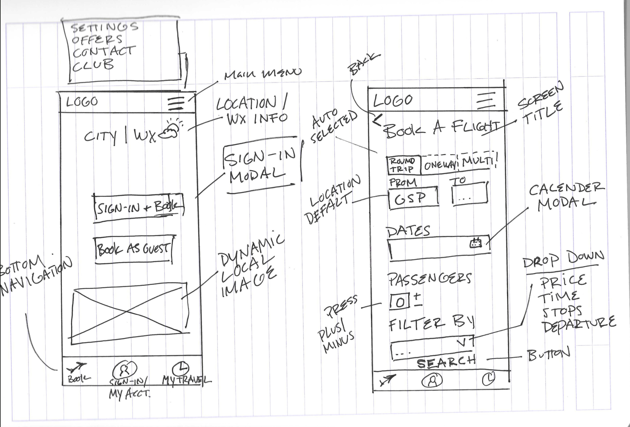
From the research findings, I translated user needs into key features and flows. I mapped out app architecture, created task flows, and developed low-fidelity wireframes. Using tools like Miro and Figma, I rapidly ideated and tested different layout concepts to ensure the app was intuitive and goal-oriented.
I brought the wireframes to life in Figma, creating an interactive high-fidelity prototype that reflects all data-founded choices, accessibility best practices, and consistent elements. This clickable prototype allows users to complete key tasks and showcases micro-interactions that support usability and positivity.
Throughout the design process, I conducted usability testing and gathered feedback to refine flows, improve content clarity, and optimize hierarchy. Iterations focused on reducing cognitive load, strengthening call-to-action placement, and ensuring the experience felt both seamless and intuitive.
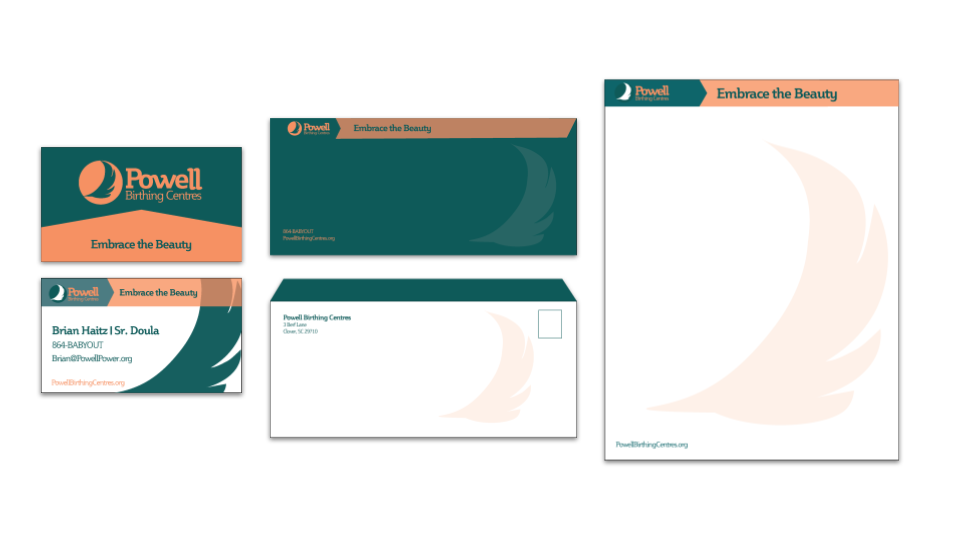
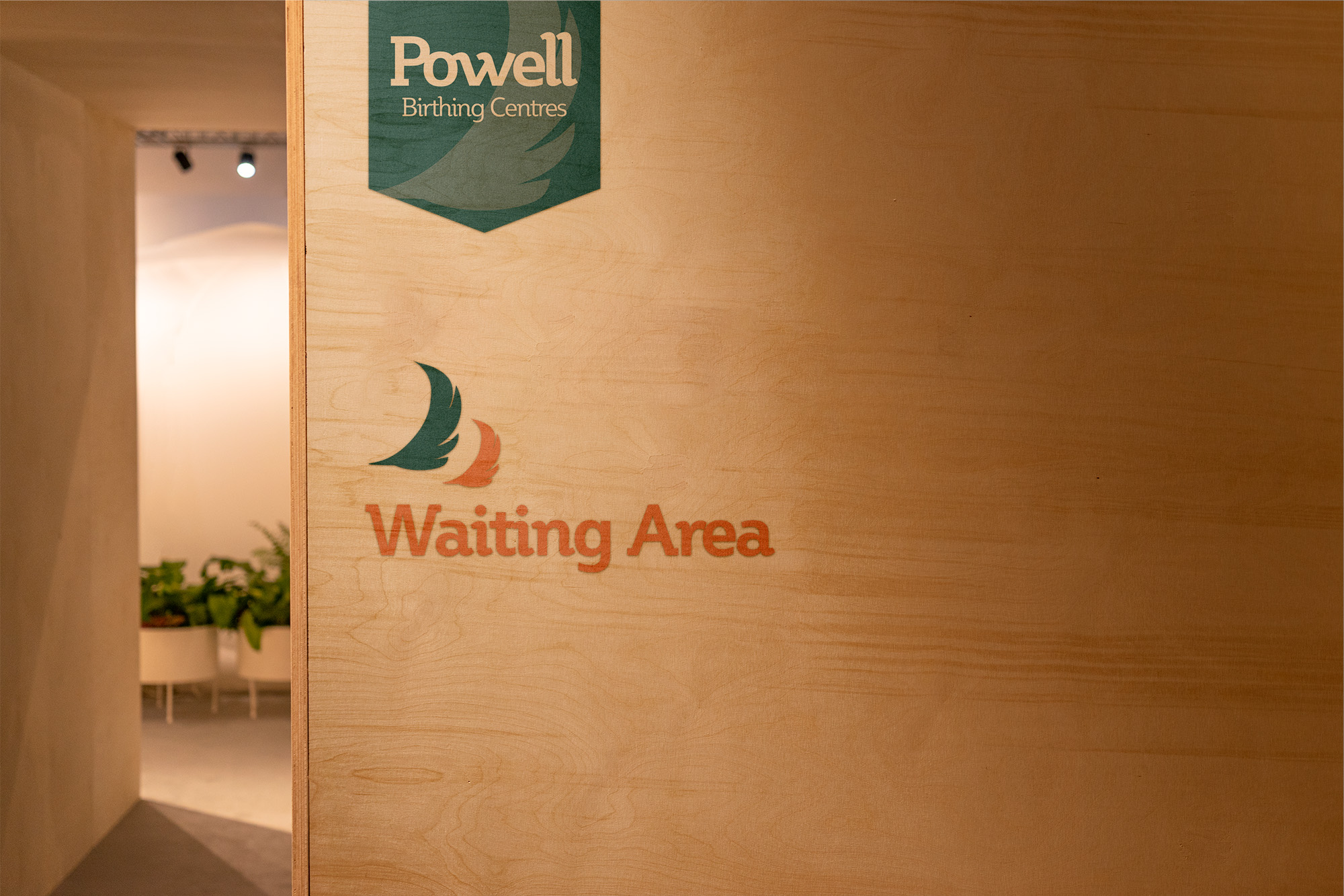
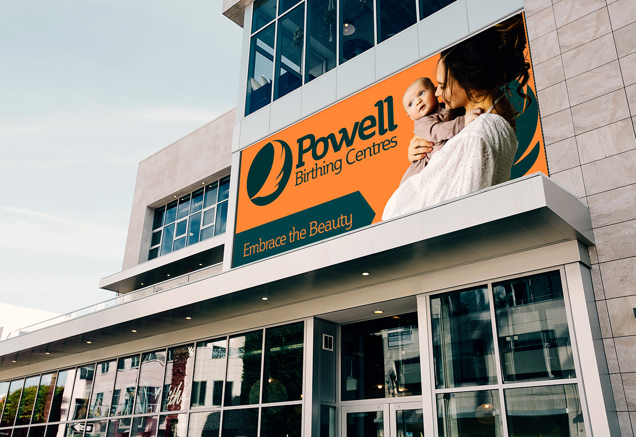
Designing this mobile experience was about more than best practices—it was about solving real user problems with thoughtful architecture, intentional interaction, and a system that feels both intuitive and human. —Brian Haitz
The final deliverable was a publicly shareable Figma file with fully annotated screens, supplemented by a PDF for handoff. The result: a clear, developer-ready guide that closes the loop between user experience design and functional execution, ready for final design and execution.

We're happy to connect, consult + see if working together is a good fit for us both.


.png)
.png)
.png)