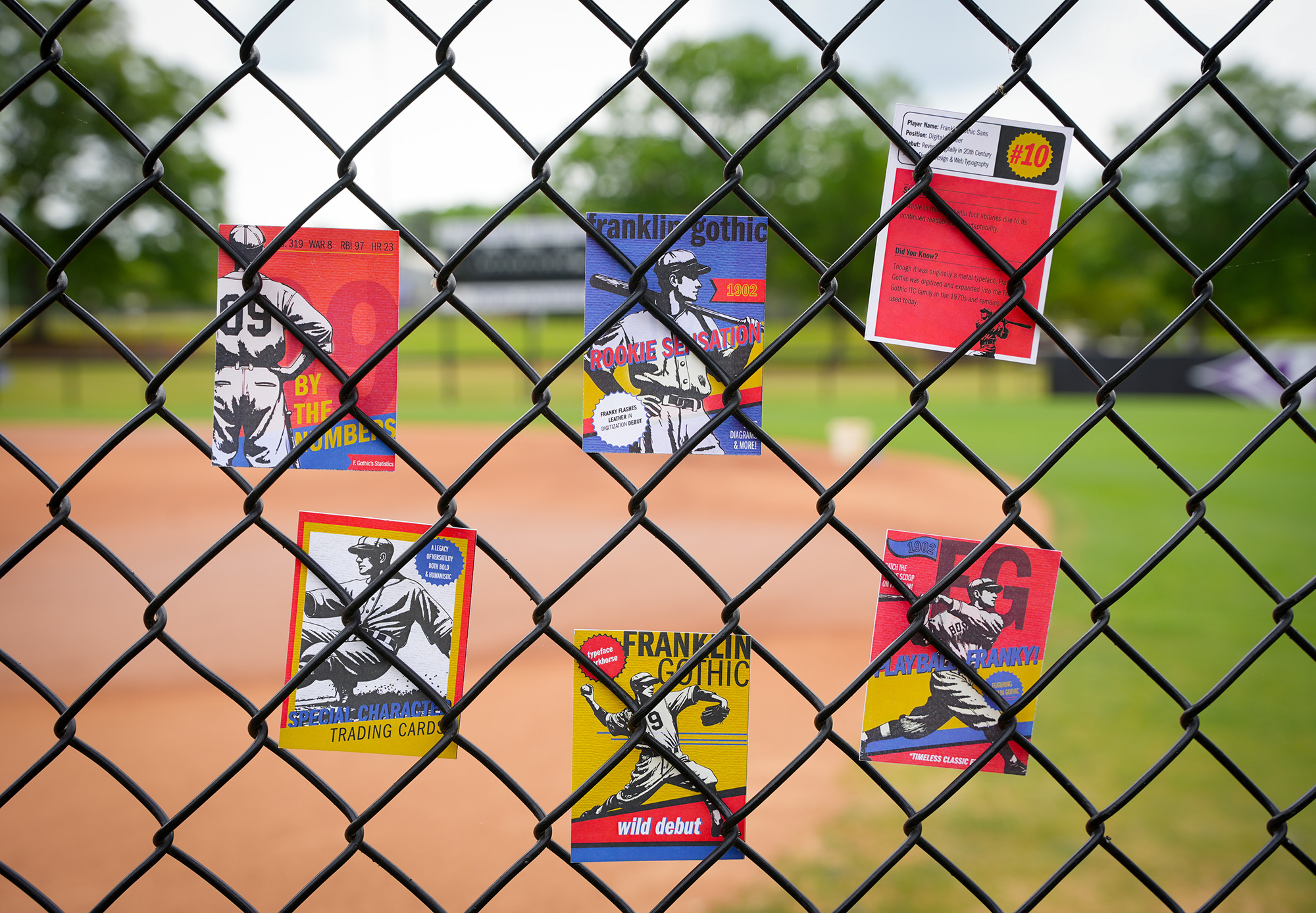
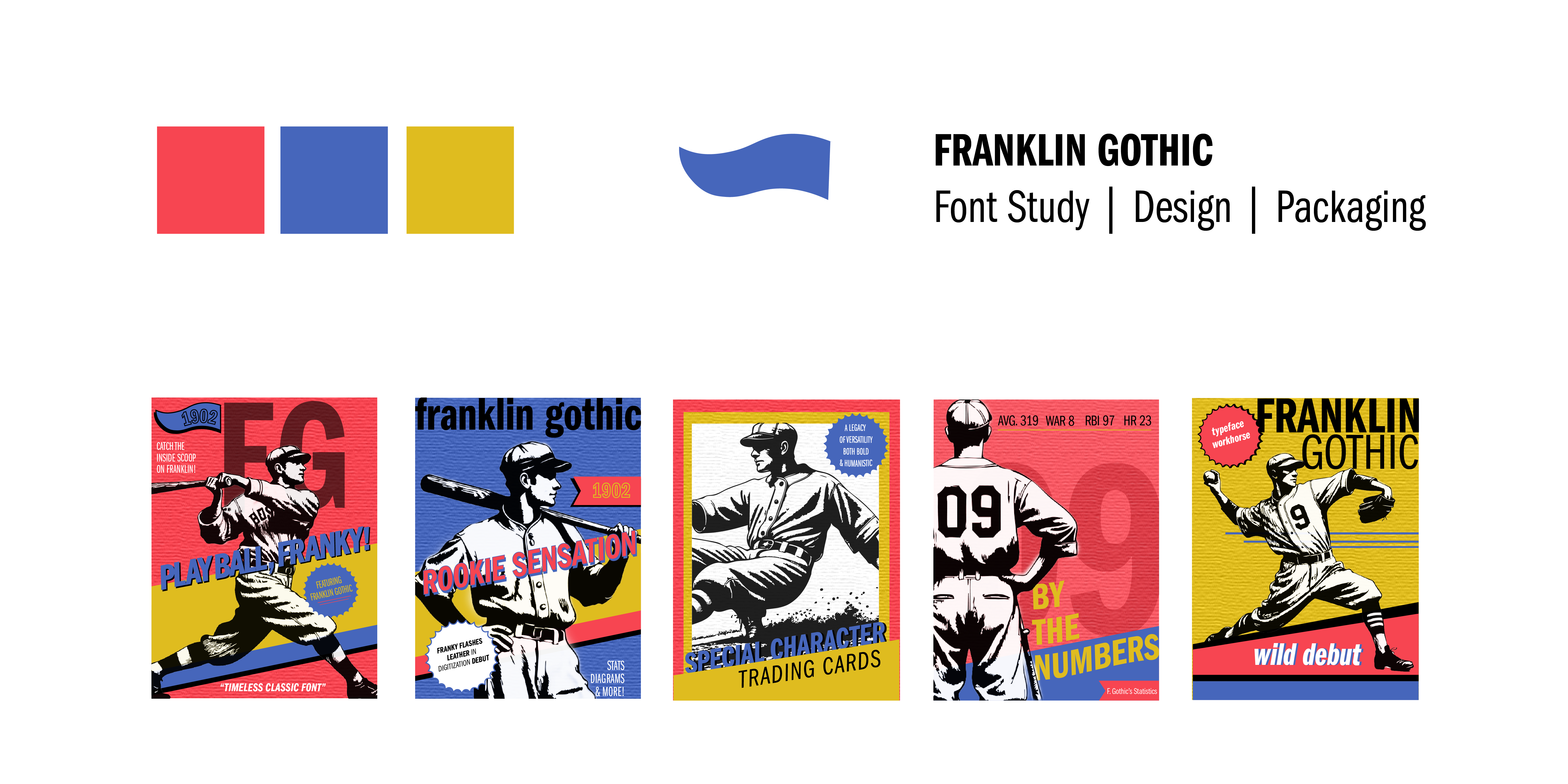
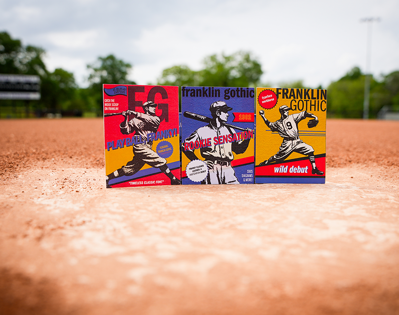
This project personifies the iconic Franklin Gothic typeface as a 1930s-era baseball player—bringing to life a cultural crossover between America’s favorite pastime and one of its most enduring typographic creations. Through the lens of vintage trading cards, Franklin Gothic steps up to the plate not just as a font, but as a full-fledged character, complete with stats, a rookie card, and a storied career in American design.
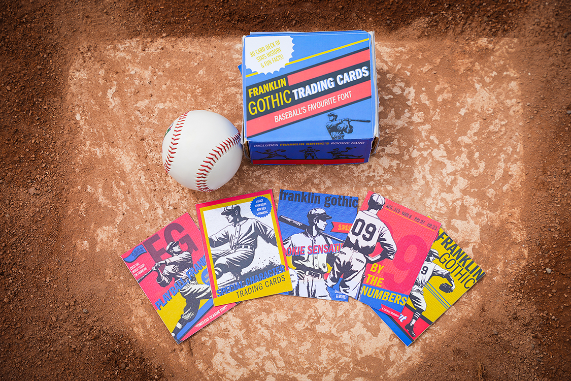
This project honed-in on every aspect of typography for the iconic Franklin Gothic typeface. The objective was to design and label individual cards (one per glyph) that included a consistent design system within the entire deck. Inspired by iconic Americana movements and culture; I designed a 30+ card deck where each card represents a typographic trait, historical fact, or real-life usage of Franklin Gothic. Every element of this deck is interwoven and styled as if Franklin (Franky) were a real-life baseball player. The result: a witty, playful, yet informative Americana throwback blending nostalgia, typhography knowledge, and design storytelling.
“Baseball and vintage card design have always held a special place in my heart—there’s magic in their texture, history, and storytelling. Combining that with the challenge of honoring Franklin Gothic, a true giant in American typography, pushed me to create something that felt both nostalgic and useful. It wasn’t just about a retro design—it was about preserving the spirit of a classic.” — Brian Haitz
In this series, Franklin Gothic is personified as a rugged, dependable all-star who debuted in 1902 with American Type Founders. His reputation grew quickly due to bold legibility, versatility across weights, and clutch performance in print, advertising, and wartime propaganda.
The result bridges graphic design and sports memorabilia, casting typography in a new role—as a living, playable character in the narrative of American culture. It’s an iconic Americana throwback, where Franklin Gothic doesn't just support design—he steps into the spotlight.

We're happy to connect, consult + see if working together is a good fit for us both.


.png)
.png)
.png)