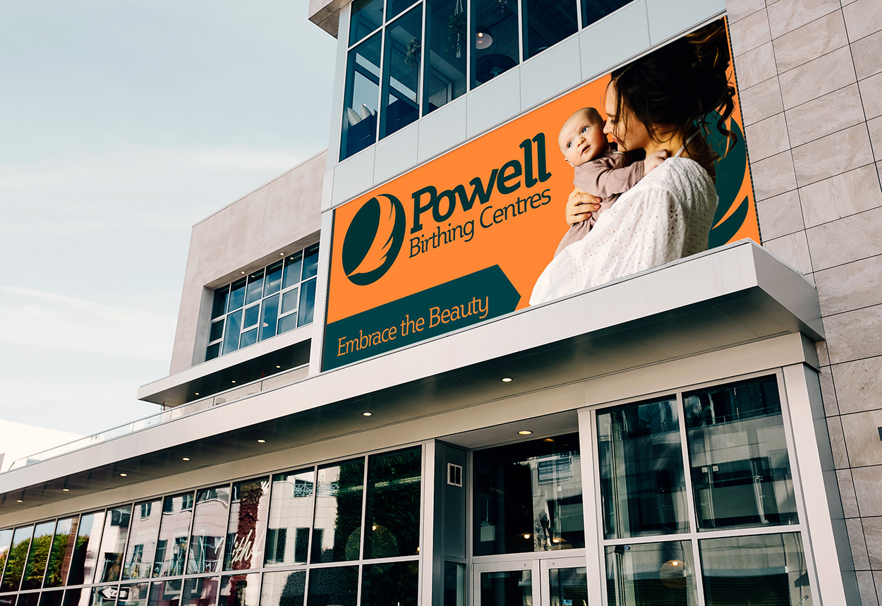
Designing a brand from the ground up that delivers comfort, confidence, and care for families. Beginning with no more than a name, Powell Birthing Centres was brought to life through this branding and messaging project.
Powell Birthing Centres was developed as a simulated brand identity project designed to reimagine the birthing center experience through a lens of empathy, empowerment, and inclusion.
The task: create a complete brand identity that would resonate with modern families, reflect the diversity of birthing experiences, and communicate clinical trust with emotional warmth.
The brand foundation was rooted in qualitative insights from real birthing experiences—positive and negative. Themes emerged around feeling seen, safe, and supported. Women and birthing people consistently emphasized the desire for non-clinical environments, individualized care, and emotional safety. Many expressed frustration with being treated like a "number" and wanted more involvement in decisions about their care.
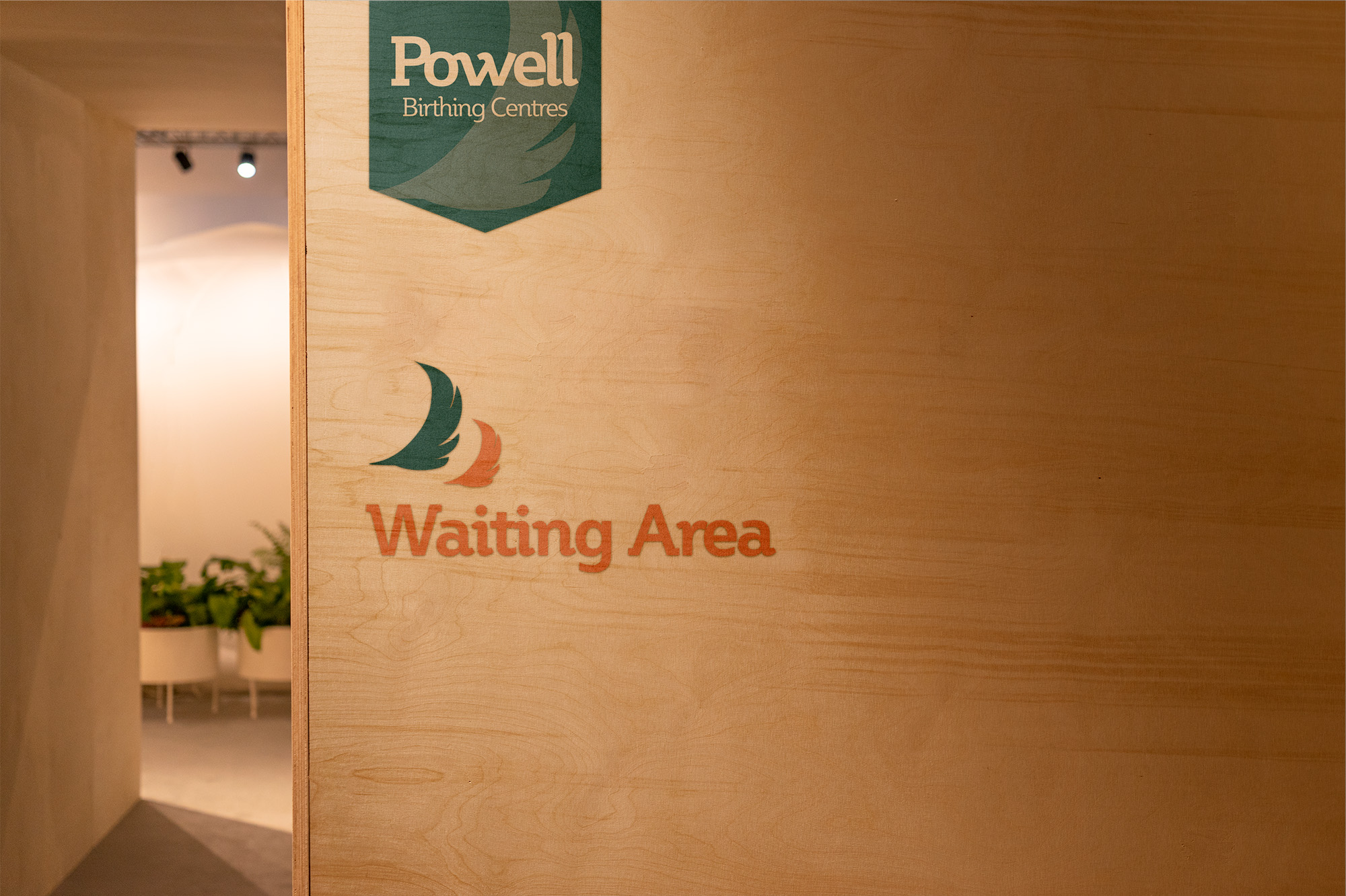
Competitive audits revealed a gap: many birthing centers leaned too heavily on medical branding or imagery that felt overly soft, dated, or binary. Powell Birthing Centres was designed to challenge that—balancing the clinical with the compassionate, the modern with the timeless.
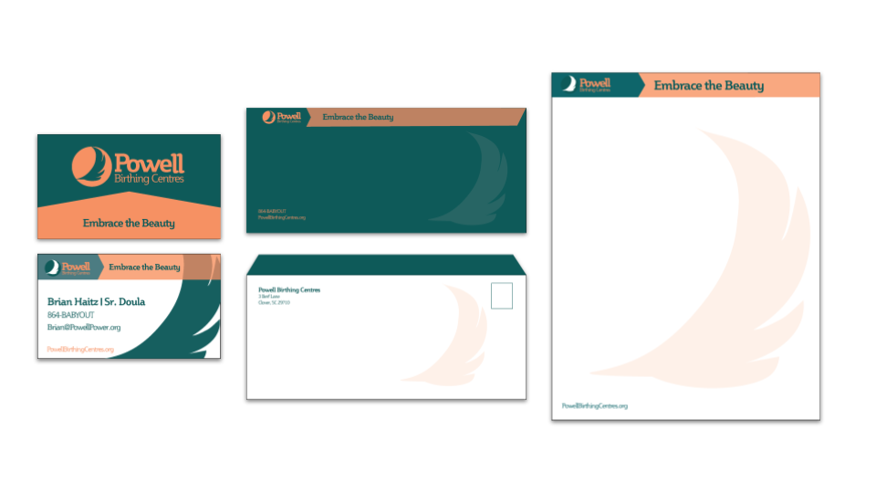
The brand centers around the phrase: "Embrace the beauty." This positioning reflects both the physical and emotional beauty of the birthing experience, while also encouraging inclusivity and acceptance of all birthing journeys—regardless of identity, outcome, or pathway.
Key deliverables included:
I appreciated the challenge of creating a brand from the ground up. Starting with nothing more than a name, I was able to craft positioning messaging based on market research that empowered the direction and positioning of this brand. — Brian Haitz
The Powell Birthing Centres identity is more than a logo or color scheme—it’s a strategic system built to convey care, respect, and empowerment. While fictional, the project demonstrates how design can elevate sensitive services by anchoring them in real human needs and modern expectations.

We're happy to connect, consult + see if working together is a good fit for us both.


.png)
.png)
.png)